rich colours
erm! At this time of year rich colours aren't really my thing - after dismal days of endless rain the last thing I want to see on the crafting desk in front of me is darkness. Hence for me spring is what I focus on and pull out the greens, whites and aqua's to go with very shiny silver.
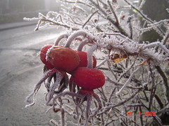 But I guess I do appreciate the dark colours, as shown in the byhand.me spotlight above. I've even blogged about my winter hips necklace in greys, black and reds which was inspired by this photo taken last christmas in scotland. My sister jokingly referred to it as my 'winter hips' so the name stuck (but thankfully the pudge didn't!).
For some reason whenever I do think of rich colours I reach for the copper wire or even pewter. Copper seems to contrast well with jewel tones and even clash beautifully with hot pink.
Silver just seems too bright and shiny to be weighed down with rich tones (though dead centre above you can see I've started oxidising it!). My comfort zone is seafoam, aqua, pale green, white; all elements which blend well with polished sterling.
Except in cufflinks - making jewelry for men throws me into the rich colours world and there I am happy to mix it with the silver.
Category Article "rich colours", blogfire, handcrafted, jewelry